文章主题:
import numpy as np
import pandas as pd
import time
import seaborn as sns
import matplotlib.pyplot as plt
import matplotlib as mpl
from matplotlib.pyplot import MultipleLocator
plt.rcParams[font.sans-serif] = [SimHei] # 中文字体设置-黑体
plt.rcParams[axes.unicode_minus] = False # 解决保存图像是负号-显示为方块的问题
sns.set(font=SimHei) # 解决Seaborn中文显示问题
matplotlib 多柱状图
#柱高信息
Y = y.tolist()
Y1 = y1.tolist()
X = np.arange(len(x.tolist()))
bar_width = 0.25
tick_label = x.tolist()# [A,B,C,D,E]
#显示每个柱的具体高度
for x,y in zip(X,Y):
plt.text(x+0.005,y+0.005,%.0f %y, ha=center,va=bottom)
for x,y1 in zip(X,Y1):
plt.text(x+0.24,y1+0.005,%.0f %y1, ha=center,va=bottom)
#绘制柱状图
plt.bar(X, Y, bar_width, align=”center”, color=”#2e75b6″, label=”label_name”, alpha=0.5)
plt.bar - (X+bar_width, Y1, bar_width, color=”#c00000″, align=”center”, \
label=”label_name”, alpha=0.5)
frame = plt.gca()
# y 轴不可见
frame.axes.get_yaxis().set_visible(False)
# x 轴不可见
# frame.axes.get_xaxis().set_visible(False)
plt.xlabel(“xlabel_name”)
plt.ylabel(“ylabel_name”)
# plt.title(Picture Name)
plt.xticks(X+bar_width/2, tick_label)
#显示图例
plt.legend()
#plt.show()
plt.savefig(iamge.png,dpi = 400)
组合图:折线图+面积图
#绘制基础图层
x=df.iloc[:-1,0].values.tolist()# x轴/横轴
y1=df.iloc[:-1,1].values.tolist()# y轴/纵轴
mycolors = [tab:red, tab:blue, tab:green, tab:orange, tab:brown, tab:grey, tab:pink, tab:olive]
columns = [column1, column2]
# 组合图:第一个图,进店 面积图
fig, ax1 = plt.subplots(figsize=(10,6))
frame = plt.gca()
# x 轴不可见
frame.axes.get_xaxis().set_visible(False)
# fig.set_facecolor(w)
ax1.set_title(title, fontsize=16)
ax1.set_xlabel(xlabel, fontsize=16)
ax1.set_ylabel(columns[1], fontsize=16, color=mycolors[2])
# ax1 = sns.barplot(x=column1, y=column2, data = df.iloc[:-1,:], palette=summer)# 条形图
ax1.fill_between(x, y1=y1, y2=0, label=columns[1], alpha=0.5, color=mycolors[2], linewidth=2)# 面积图
# 组合图:第二个图,途径,
# ax1.tick_params(axis=y)
#twinx共享x轴(类似的语法,如共享y轴twiny)
ax2 = ax1.twinx()
#第二个图,折线图
ax2.set_ylabel(ylabel, fontsize=16, color=mycolors[1])
ax2 = sns.lineplot(x=column1, y=column2, data = df.iloc[:-1,:], sort=False, color=mycolors[1])
ax2.tick_params(axis=y, color=mycolors[1])
#显示绘制结果
# plt.show()
plt.savefig(image.png,dpi = 400)
组合图:双折线图
#绘制基础图层
y=df.iloc[:-1,1]
y2=df.iloc[:-1,2]
x=df.iloc[:-1,0]
fig, ax1 = plt.subplots(figsize=(10,6))
color = tab:green
ax1.set_title(title, fontsize=16)
ax1.set_xlabel(xlabel, fontsize=16)
ax1.set_ylabel(ylabel, fontsize=16, color=color)
#第一图条形图
ax1 = sns.lineplot(x=column1, y=column2, data = df.iloc[:-1,:], sort=False, color=color)
ax1.tick_params(axis=y)
# 设置数字标签
for a, b in zip(x, y):
plt.text(a, b, b, ha=center, va=bottom, fontsize=10)
#twinx共享x轴(类似的语法,如共享y轴twiny)
ax2 = ax1.twinx()
color = tab:red
#第二个图,折线图
ax2.set_ylabel(ylabel, fontsize=16, color=color)
ax2 = sns.lineplot(x=column1, y=column2, data = df.iloc[:-1,:], sort=False, color=color)
ax2.tick_params(axis=y, color=color)
# 设置数字标签
for a, b in zip(x, y2):
plt.text(a, b, b, ha=center, va=bottom, fontsize=10)
#显示绘制结果
# plt.show()
plt.savefig(image.png,dpi = 400)
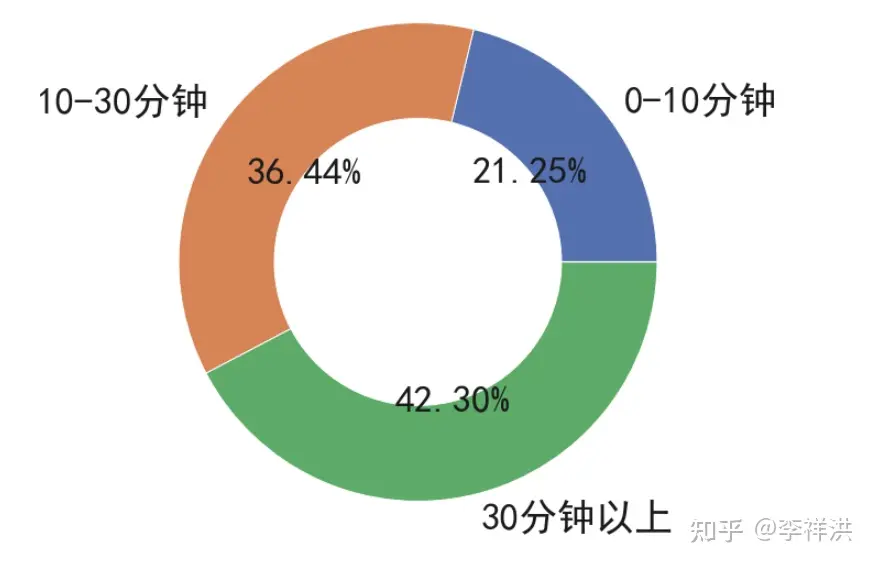
环图
plt.figure(figsize=(10,10)) #新建画布,画布大小为8*8
plt.pie(df.iloc[:,3]
,radius=1 # 设置半径为1
,labels=df.iloc[:,0].values.tolist() #设置各个角的标签
,autopct=%.2f%% #设置精度为小数点后两位
,textprops={fontsize: 35, color: k} #设置标签字体和颜色
,wedgeprops=dict(width=0.4, edgecolor=w)); #设置饼弧宽度和边框颜色
plt.savefig(image.png,dpi = 400)
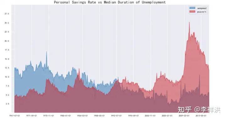
# 案例
# Import Data
df = pd.read_csv(“https://github.com/selva86/datasets/raw/master/economics.csv”)
# Prepare Data
x = df[date].values.tolist()
y1 = df[psavert].values.tolist()
y2 = df[uempmed].values.tolist()
mycolors = [tab:red, tab:blue, tab:green, tab:orange, tab:brown, tab:grey, tab:pink, tab:olive]
columns = [psavert, uempmed]
# Draw Plot
fig, ax = plt.subplots(1, 1, figsize=(16,9), dpi= 80)
ax.fill_between(x, y1=y1, y2=0, label=columns[1], alpha=0.5, color=mycolors[1], linewidth=2)
ax.fill_between(x, y1=y2, y2=0, label=columns[0], alpha=0.5, color=mycolors[0], linewidth=2)
# Decorations
ax.set_title(Personal Savings Rate vs Median Duration of Unemployment, fontsize=18)
ax.set(ylim=[0, 30])
ax.legend(loc=best, fontsize=12)
plt.xticks(x[::50], fontsize=10, horizontalalignment=center)
plt.yticks(np.arange(2.5, 30.0, 2.5), fontsize=10)
plt.xlim(-10, x[-1])
# Draw Tick lines
for y in np.arange(2.5, 30.0, 2.5):
plt.hlines(y, xmin=0, xmax=len(x), colors=black, alpha=0.3, linestyles=”–“, lw=0.5)
# Lighten borders
plt.gca().spines[“top”].set_alpha(0)
plt.gca().spines[“bottom”].set_alpha(.3)
plt.gca().spines[“right”].set_alpha(0)
plt.gca().spines[“left”].set_alpha(.3)
plt.show()
PPT
# 导入包
from pptx import Presentation
from pptx.chart.data import ChartData,XyChartData,BubbleChartData,CategoryChartData
from pptx.enum.chart import XL_CHART_TYPE,XL_LABEL_POSITION,XL_LEGEND_POSITION
from pptx.util import Inches
from pptx.enum.text import MSO_ANCHOR, MSO_AUTO_SIZE,MSO_VERTICAL_ANCHOR,PP_PARAGRAPH_ALIGNMENT,PP_ALIGN
from pptx.dml.color import RGBColor
from pptx.enum.dml import MSO_THEME_COLOR
from pptx.enum.shapes import MSO_SHAPE_TYPE,MSO_SHAPE
from pptx.util import Pt,Cm
# 可以增加ppt页,或者替换原有ppt中的内容进行更新。
# 该包实现的特效无法做到软件中的强大,实现一些图片,文字的简单布局以及样式是可以的
prs = Presentation(模板.pptx)
替换某一页中的指定字符块:
导入哪一页,在替换
shape=prs.slides[0].shapes
for i in range(0,len(shape)):
if(shape[i].has_text_frame):
for paragraph in shape[i].text_frame.paragraphs:
for run in paragraph.runs:
if 品牌 in run.text:
run.text=brand_name
添加图片到指定页的指定位置
slide2=prs.slides[2]
# 设置待添加的图片
img_path = ./3.png
left1, top1, width1, height1 = Cm(0), Cm(0), Cm(19), Cm(19)
slide2.shapes.add_picture(image_file=img_path,left=left1,top=top1,width=width1,height=height1)
添加文字框并指定内容
left, top, width, height = Cm(6), Cm(17), Cm(12), Cm(1.2)
tf = slide7.shapes.add_textbox(left=left, top=top, width=width, height=height).text_frame
tf.paragraphs[0].text = remarks
tf.paragraphs[0].font.size = Pt(10)
添加表格(字体大小,单元格颜色)
rows, cols = 2,len(sheet_各店月客流_df.iloc[2:-1,1].values.tolist())# 根据数据行数创建表格列数
left, top, width, height = Cm(0.5), Cm(3), Cm(33), Cm(2)
table=shapes.add_table(rows,cols,left,top,width,height).table
data = [
x,x
]
for row in range(rows):
for col in range(cols):
table.cell(row,col).text = str(data[row][col])
def iter_cells(table):
for row in table.rows:
for cell in row.cells:
cell.fill.solid()
cell.fill.fore_color.rgb = RGBColor(163, 163, 163)
yield cell
for cell in iter_cells(table):
for paragraph in cell.text_frame.paragraphs:
for run in paragraph.runs:
run.font.size = Pt(16)
表格1
实现效果:
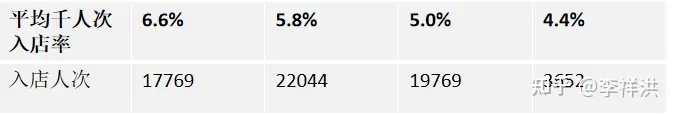
数据结构:
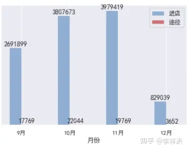
[[平均千人次入店率, 6.6%, 5.8%, 5.0%, 4.4%],
[入店人次, 17769, 22044, 19769, 3652]]代码:
left, top, width, height = Cm(0.5), Cm(3.7), Cm(16), Cm(2.5)
s1=serie.values.tolist()
s2=serie.values.tolist()
shapes=slide.shapes
rows, cols = 2,len(s1)# 行;列
table=shapes.add_table(rows,cols,left,top,width,height).table
data = [
s1,s2
]
for row in range(rows):
for col in range(cols):
table.cell(row,col).text = str(data[row][col])
def iter_cells(table):
for row in table.rows:
for cell in row.cells:
cell.fill.solid()# 首行加粗
cell.fill.fore_color.rgb = RGBColor(242, 242, 242)# 表格背景颜色
yield cell
for cell in iter_cells(table):
for paragraph in cell.text_frame.paragraphs:
for run in paragraph.runs:
run.font.size = Pt(14) # 字体大小
run.font.color.rgb = RGBColor(0, 0, 0) # 字体颜色
表格2
效果如下:
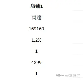
数据结构:
[店铺1, 商超, 169160, 1.2%, 1, 4899, 1]
代码:
data=df.iloc[0,:-2].values.tolist()
shape=slide.shapes
left, top, width, height = Cm(6), Cm(6), Cm(6), Cm(6.5)
rows, cols = 7,1
table=shape.add_table(rows,cols,left,top,width,height).table
# 调整行高
for i in range(rows):
table.rows[i].height = Cm(0.95)
def set_cell_center(cell):
“””
设置单元格文字居中显示
:param cell:
:return:
“””
paragraph = cell.text_frame.paragraphs[0]
paragraph.alignment = PP_ALIGN.CENTER
cell.vertical_anchor = MSO_ANCHOR.MIDDLE
for row in range(rows):
for col in range(cols):
table.cell(row,col).text = str(data[row])
set_cell_center(table.cell(row,col))
def iter_cells(table):
for row in table.rows:
for cell in row.cells:
cell.fill.solid()
cell.fill.fore_color.rgb = RGBColor(255, 255, 255)
yield cell
for cell in iter_cells(table):
for paragraph in cell.text_frame.paragraphs:
for run in paragraph.runs:
run.font.size = Pt(12)
run.font.color.rgb = RGBColor(0, 0, 0)
run.alignment = PP_ALIGN.CENTER
表格三:
效果:
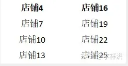
数据结构:
🌟文章写作大师在此!👀您提供了一个商品列表,这里有四个精选店铺:🏠店铺6、🏡店铺9、🏡店铺12和🏡店铺15。每个店铺都以其独特的产品和服务吸引着顾客的眼球。想要深入了解吗?点击下方链接,探索品质购物的乐园吧!🎉店铺18、🏠店铺21、🏡店铺24和🏡店铺27,等待您的光临,保证让您满载而归!🛍️记得,优质选择就在您指尖轻轻一点的地方哦!✨SEO优化提示:使用相关关键词如”精选店铺”、”商品列表”、”品质购物”、”独特产品”、”服务吸引顾客”等。同时,保持句子流畅和自然,融入emoji符号以增加可读性和吸引力。
代码:
cols = 2
rows=math.ceil(len(df)/2)# 向上取整
left, top, width, height = Cm(6.5), Cm(14.5), Cm(6), Cm(3)
table=shape.add_table(rows,cols,left,top,width,height).table
# 调整行高
for i in range(rows):
table.rows[i].height = Cm(0.95)
def set_cell_center(cell):
“””
设置单元格文字居中显示
:param cell:
:return:
“””
paragraph = cell.text_frame.paragraphs[0]
paragraph.alignment = PP_ALIGN.CENTER
cell.vertical_anchor = MSO_ANCHOR.MIDDLE
for row in range(2):
for col in range(rows):
table4.cell(col,row).text = str(data[row][col])
set_cell_center(table.cell(col,row))
def iter_cells(table):
for row in table.rows:
for cell in row.cells:
cell.fill.solid()
cell.fill.fore_color.rgb = RGBColor(255, 255, 255)
yield cell
for cell in iter_cells(table):
for paragraph in cell.text_frame.paragraphs:
for run in paragraph.runs:
run.font.size = Pt(12)
run.font.color.rgb = RGBColor(0, 0, 0)
run.alignment = PP_ALIGN.CENTER

AI时代,拥有个人微信机器人AI助手!AI时代不落人后!
免费ChatGPT问答,办公、写作、生活好得力助手!
搜索微信号aigc666aigc999或上边扫码,即可拥有个人AI助手!